Your website’s design could be hurting your conversions. Here’s why:
You should remove distractions (where it matters the most) 🎯
When your users are ready to take action—like entering their credit card details or booking a demo—the last thing you want is to distract them.
But guess what?
Many websites do exactly that.
Here are the most common “distracting” mistakes I always see (and how to fix them):
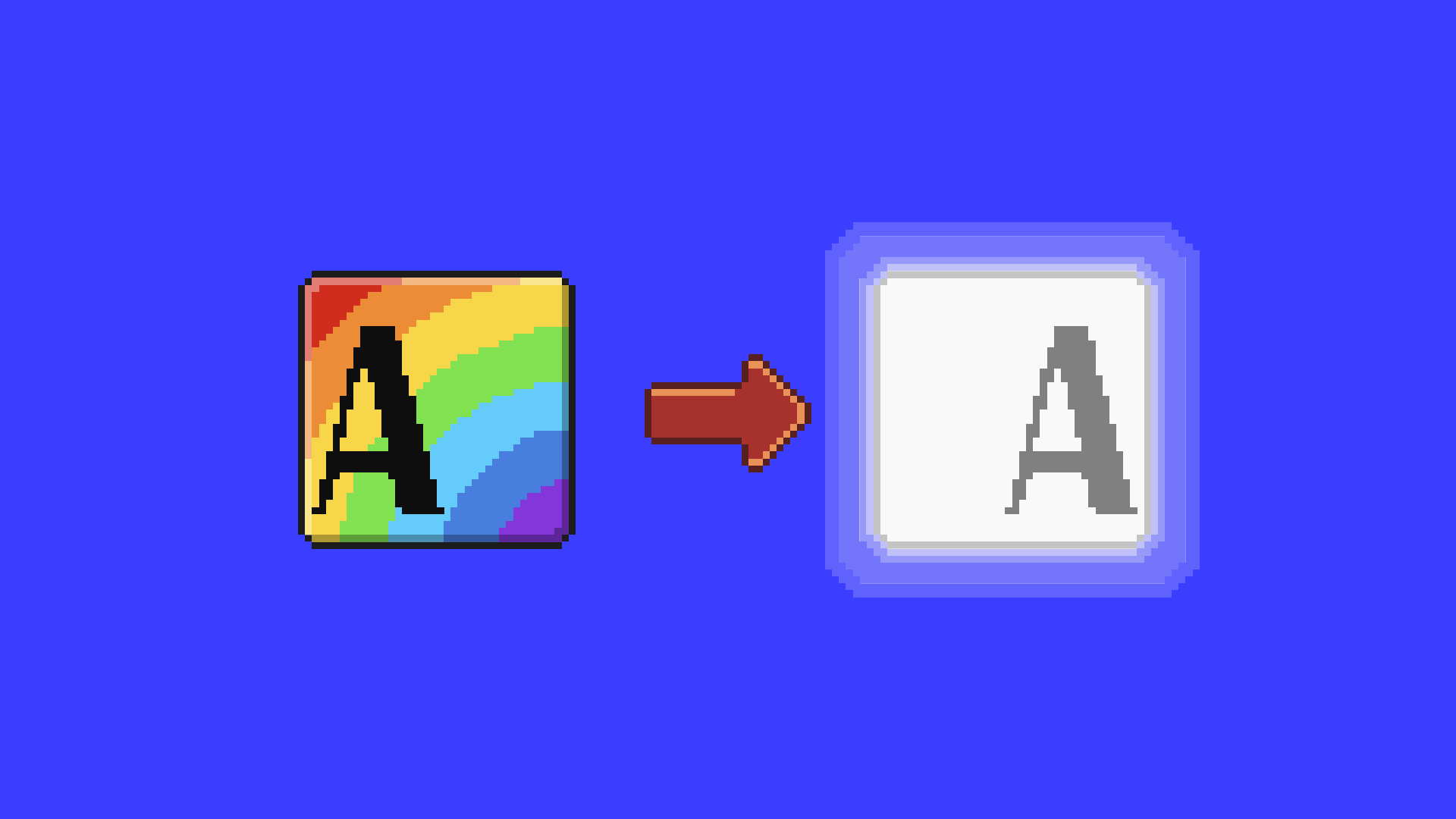
Mistake #1: Too many colors 🌈
Colorful logos and images can overshadow your CTA. They might even look clickable when they shouldn’t be. Mute those colors.
✅ The fix: On checkout pages and “book a demo” pages → convert non-essential images and logos to grayscale.
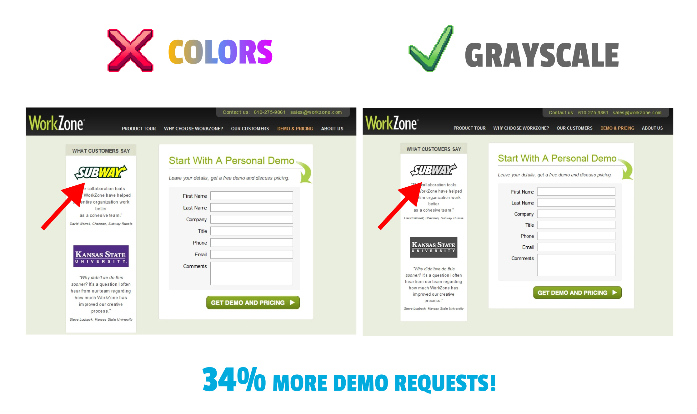
WorkZone, a project management tool, made this mistake on their demo request page: They proudly showed colorful customer logos.
We usually say that social proof on form pages is a good thing — but the colorful logos were actually distracting users from the form itself.
🧠 What they did: Changed customer logos to grayscale.
📈 The result: A 34% increase in form submissions.
Mistake #2: Clickable logos 🖱️
Your own logo shouldn’t be clickable on checkout pages and forms.
Why? Because it tempts users to navigate away from completing the desired action.
✅ The fix: Make your menu logo static on checkout and sign-up pages.
Mistake #3: Distracting footers 🔗
Footers are packed with links that act as “exit opportunities” = they invite users to explore (rather than convert).
✅ The fix: Remove the footer entirely or minimize it on critical pages.
I counted 93 (!) exit opportunities on Cato Networks’ demo page. It’s a well-known cybersecurity company, but their footer might be costing them leads. Can you imagine how many people clicked away instead of submitting their details?
Remove the footer!
What to do instead? 👀
Take a look at your “Request a Demo” and checkout pages today. Is there anything that might be pulling users away?
Here are three powerful ways to remove distractions and increase conversions: 👇
Use grayscale images: Reduce visual clutter.
Static logos: Prevent accidental navigation away.
Minimal footers: Cut down on exit points.
Design for action. Use A/B testing to see what works best.
See you next week ✌️
Tom
If you enjoyed this marketing idea, please tap the Like button below ♥️ Thank you!
Thanks for the article! You are definitely a person I want to learn from. :)