

Color psychology is mostly nonsense 🌈
(Here's what actually works)

Marketing gurus want you to believe each color has a fixed meaning.
🟦 “Blue = trust!”
🟩 “Green = growth!”
🟪 “Purple = luxury!”
That’s NOT how color works ❌
The science is clear:
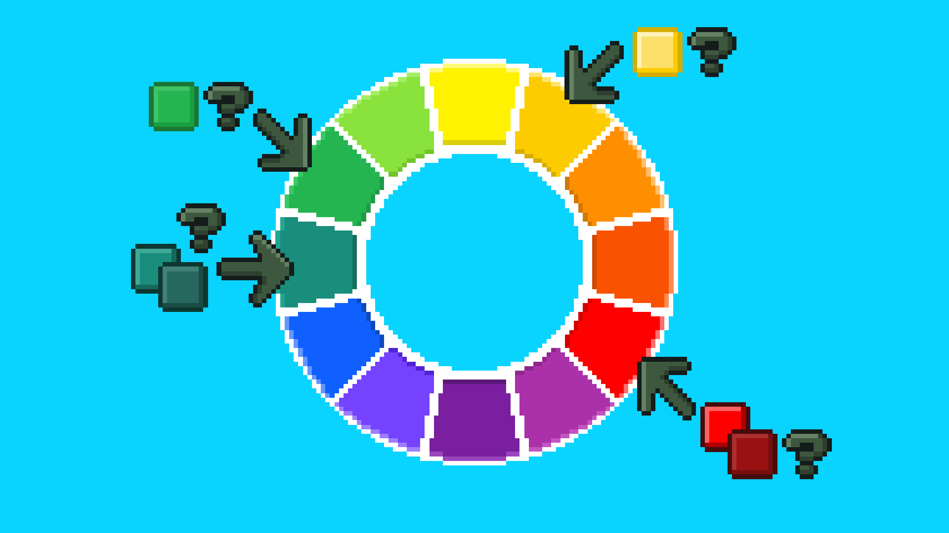
Color preferences come from *personal* experiences.
If blue is your favorite color, it’s because you’ve had positive experiences with blue objects — like a childhood toy or a favorite blanket.

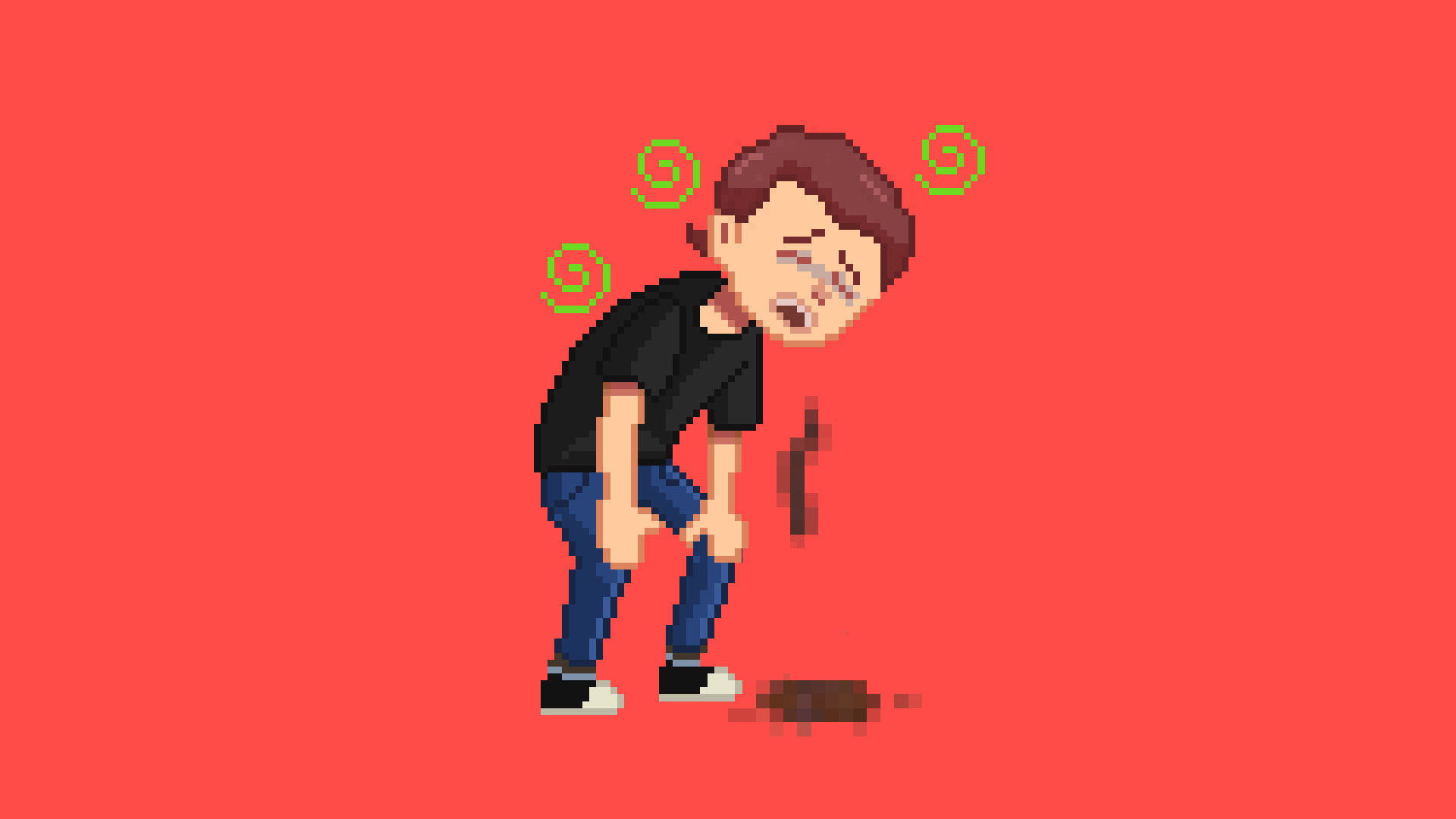
And if you had negative experiences with brown (like most humans do 💩), you probably hate brown.
New life experiences constantly reshape these preferences.
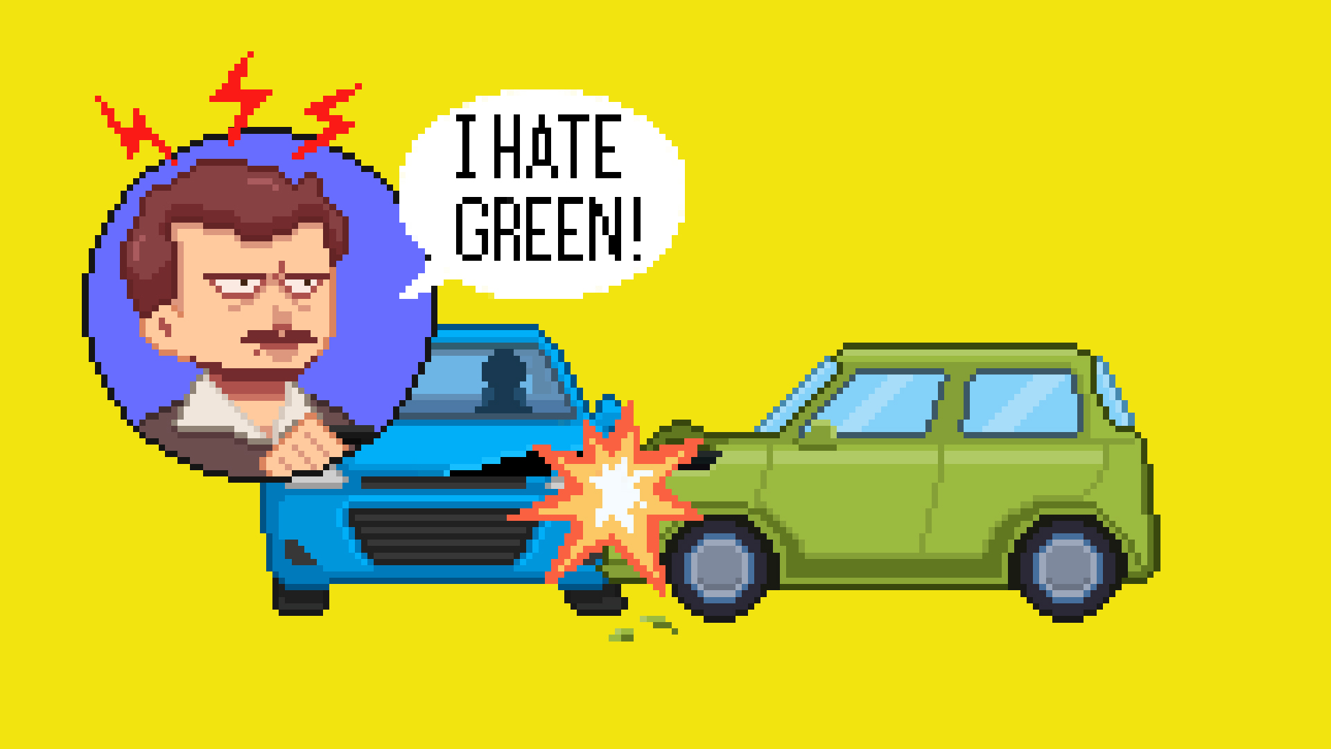
One traumatic experience with a green car could turn green into your least favorite color overnight.
That’s what scientists call “ecological valence theory”. It means that no two people will see the same color the same way. Your amazing blue might be someone else’s meh.
But there’s good news… ↓
Not everything about color is personal.
Here’s what actually matters ✅
While we can't control individual color preferences — science discovered 3 properties that affect EVERYONE the same way:
1. Temperature (Warm vs. Cool) 🌡️
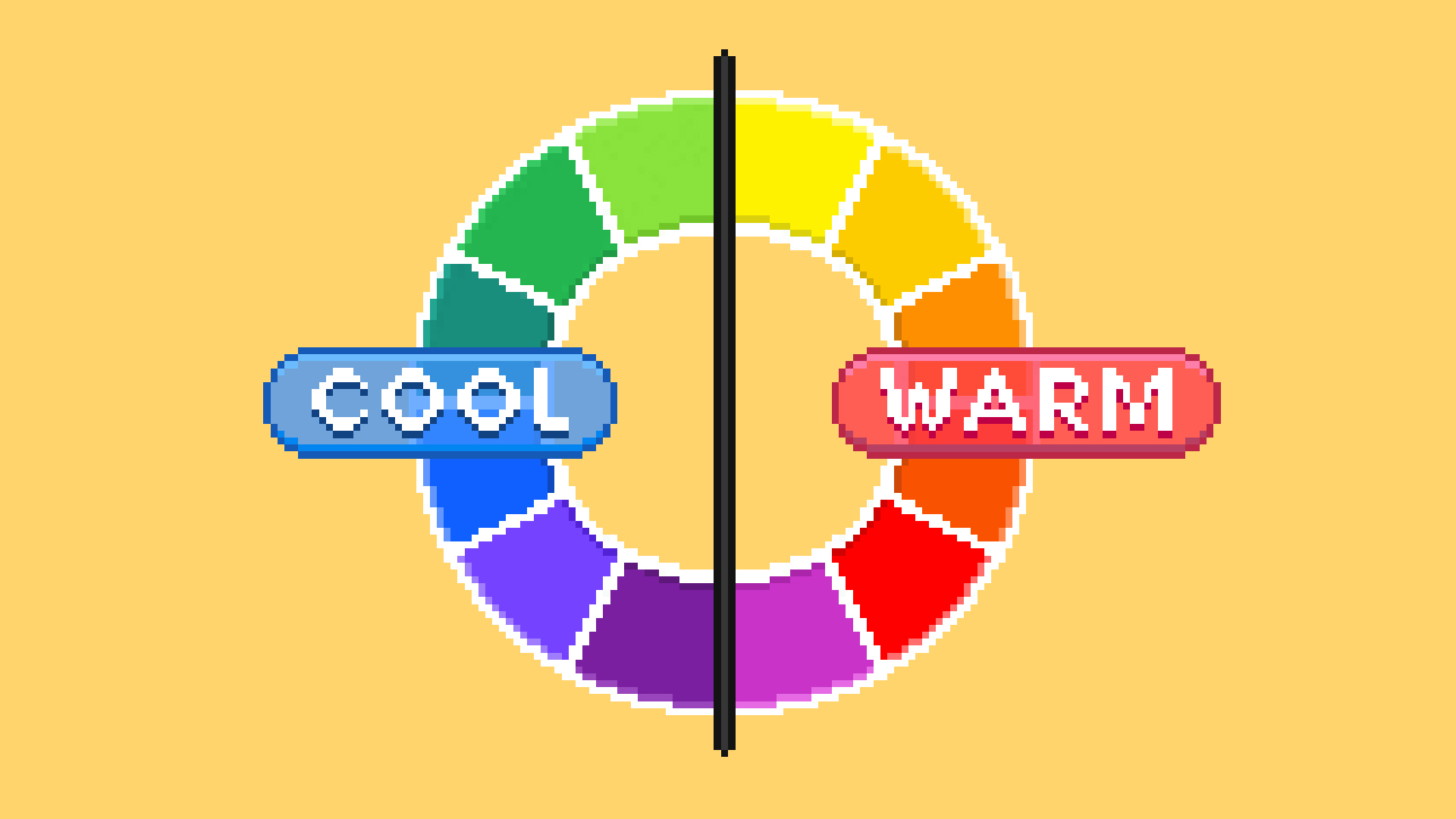
Temperature is the only truly universal color meaning.
🟥 Warm colors (red, orange, yellow) feel physically closer to us. They create urgency and grab attention.
🟦 Cool colors (blue, green, purple) feel physically farther away. They create calmness and less pressure.
That’s why red “Buy Now” buttons outperform blue ones consistently. It’s not about meaning — it’s about proximity.
For CTAs and urgent items, use warm colors.
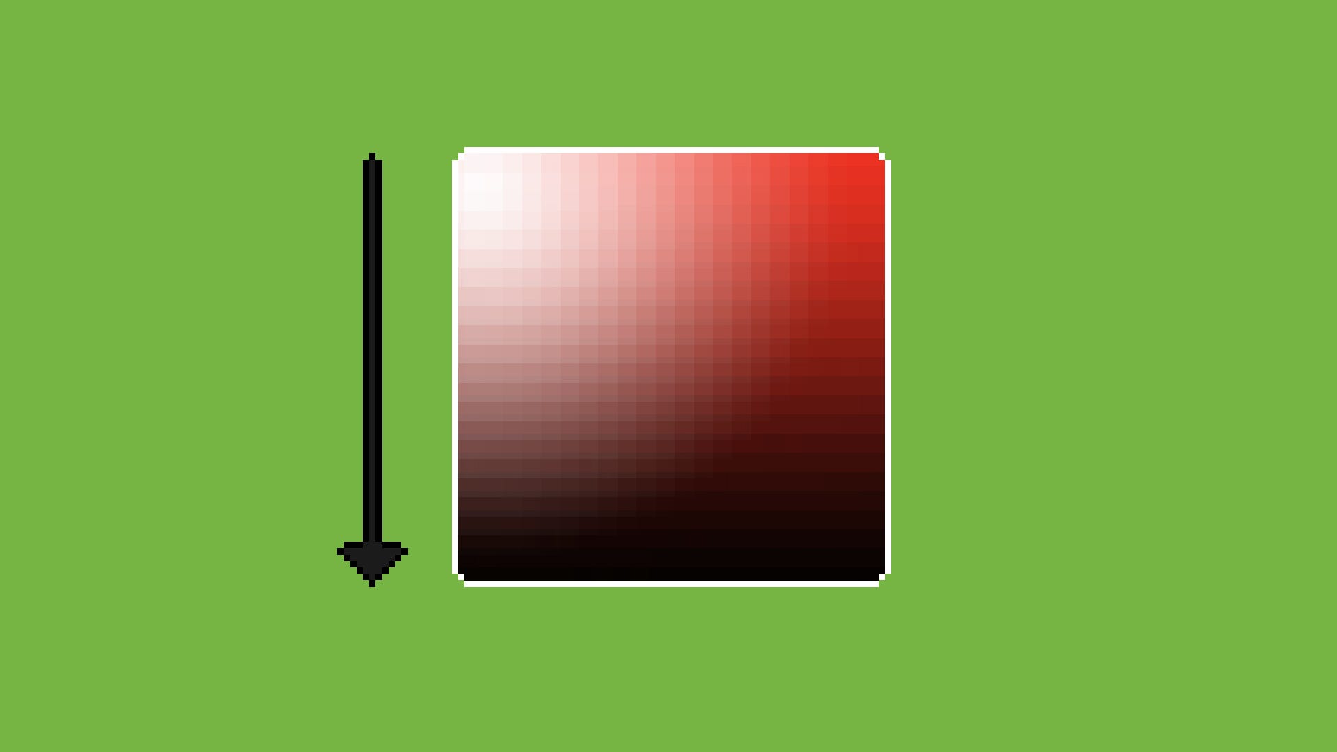
2. Saturation (Vividness) 🔆
The specific color doesn’t matter here: The more we move to the right (= increase saturation) → the easier it is to notice the color.
That’s why higher saturation makes objects always appear larger.
🔶 More saturated = looks bigger
🔸 Less saturated = looks smaller

I really love the study that proved it: When people went shopping for suitcases online, they naturally picked vivid colors when they wanted large luggage, and pale colors when they wanted compact ones.
Same suitcase, different saturation - yet it changed how big people thought it was.
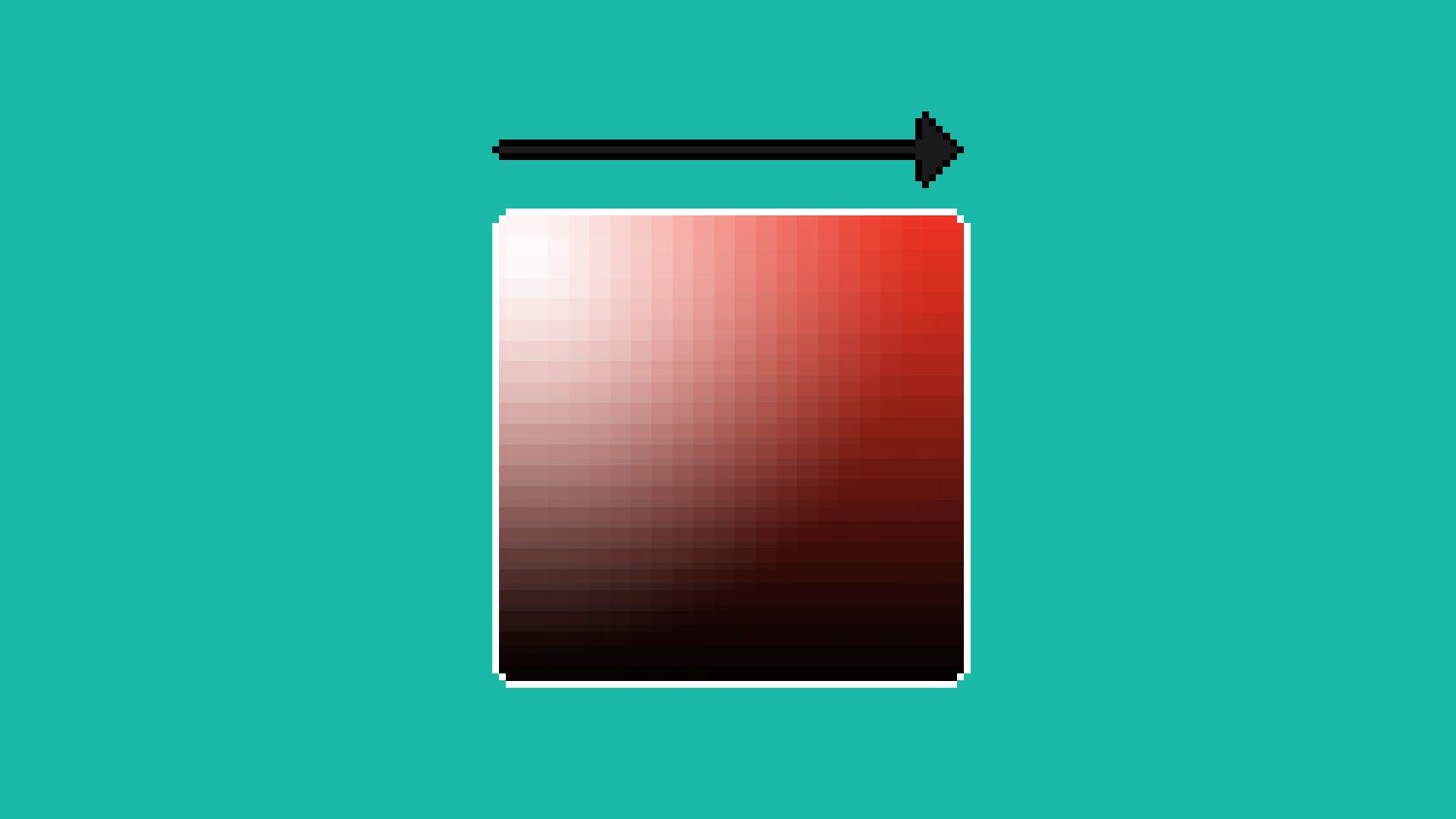
3. Value (Lightness) ⚪️
Universally, it’s common to believe that white = clean. Anything we put on top of the white canvas will be visible and noticeable.
⬜️ Light backgrounds create transparency and trust.
⬛️ Dark backgrounds create privacy and intimacy.
That’s why adult-only websites are dark (but your online bank account is light).
The Bottom Line 🧠
Forget picking the “right” color. Just answer these:
Does this element need to feel urgent or immediate? → Use warm colors ✅
Should this element stand out from everything else? → Increase saturation ✅
Are we building trust here? → Use a light background ✅
Do users need privacy? → Use a dark background ✅
That’s it. Pick any color you want - just get these three properties right.
Quick science note: Yes, there’s research showing specific colors = specific feelings. But that gets messy fast (culture, context, trends...). These 3 properties work everywhere, every time. Simple beats complex. Focus on them.
See you next week ✌️
Tom
— If you enjoyed this marketing idea, please tap the Like button below ♥️ Thank you!
As an artist/digital marketer - I can’t agree more! Thank you ✨☀️
Having an undergrad in fine arts this color theory break is so much more superior! Love it!