The ‘playground’ trick for more sign ups 🛝
The most powerful CTA? Hint: It's definitely not "Book a Demo"
Here's my all-time favorite button:
But it’s *not* about the Call to Action (CTA) itself: It’s mostly about what follows after clicking the button—a dummy version of the product, aka playground / sandbox / interactive demo, where users can get a taste of it without any friction.
Keep reading for a game-changing marketing idea.
🎯 Why “Try it yourself” playgrounds work
Our goal on the homepage is to get users to the “Aha” moment ASAP.
No one wants to give their personal details for nothing or wait for a Zoom call later. Buttons like “Sign-up” just create too much friction.
But “Try it yourself” buttons just get the user to the “Aha” much faster.
How? Behind these buttons there’s a frictionless playground where people can play with a dummy product, allowing them to understand its value immediately. And by “frictionless,” I mean no sign-up, no credit card, no ads, no lead-gen forms: nothing is blocking the way to the Aha moment. 👉 See examples of such playgrounds below.
Don’t have such a playground? Build one. Even for complex SaaS, just set up a public user with fake data and let people play around.
This also taps into a cognitive bias called “Ownership Bias”; people value things more when they feel a sense of ownership. More about this principle here.
🎖️ Let’s rank CTAs from best to worst
✅✅✅ Try it yourself
✅✅ See it in action
✅ Try an interactive demo
❌ Take a tour
❌❌ Watch a demo
❌❌❌ Book a demo / Let’s talk
❌❌❌❌ Sign-up / Start for free
❌❌❌❌❌ Start a free trial
❌❌❌❌❌❌❗ Import all your data and connect your API to our new & unknown startup just to get a sense of our useless product
The best CTAs shorten the user's journey to the "aha" moment, making it smooth and friction-free. That’s why I believe “Try it yourself” is the absolute #1 best.
Side Note:
This button should never stand alone. Always have a revenue-oriented main CTA alongside it. "Book a Demo" / "Sign-Up" are important, but complement them with a "Try it yourself" CTA.
🪤 Value-oriented buttons: It’s a trap!
Before we move on to the examples, don’t fall into this trap:
Many believe that value-oriented CTAs can boost conversions (these are CTAs that mention the benefit of the product). Just like this main button on the homepage of SentinelOne:
But that's a trap. It’s the exact same bad button, just with a different name:
❌
Take a tour➡️ Get a guided tour of our CRM❌❌
Watch a demo➡️ Watch a 2-minute video of CRM magic❌❌❌
Book a demo / Let’s talk➡️ Talk with our growth experts❌❌❌❌
Sign-up / Start for free➡️ Secure the cloud❌❌❌❌❌
Start a free trial➡️ Implement on your cloud for free❌❌❌❌❌❌❗
Import all your data and connect your API to our new & unknown startup just to get a sense of our useless product➡️ Connect your cloud
Again, the goal is to change the entire purpose of the button—to give users their well-deserved “Aha” moment, fast.
🍿 Examples of “Try it yourself” playgrounds
My favorite example: A website-building SaaS called mmm absolutely nails it. Their homepage has a button labeled "EDIT" in the bottom right corner.
And yes, it does exactly what it says—users can edit the entire homepage, experiencing the web editor product immediately. It combines the best of both worlds: “Aha” moment and a value-oriented button label.
No sign-in, no friction.
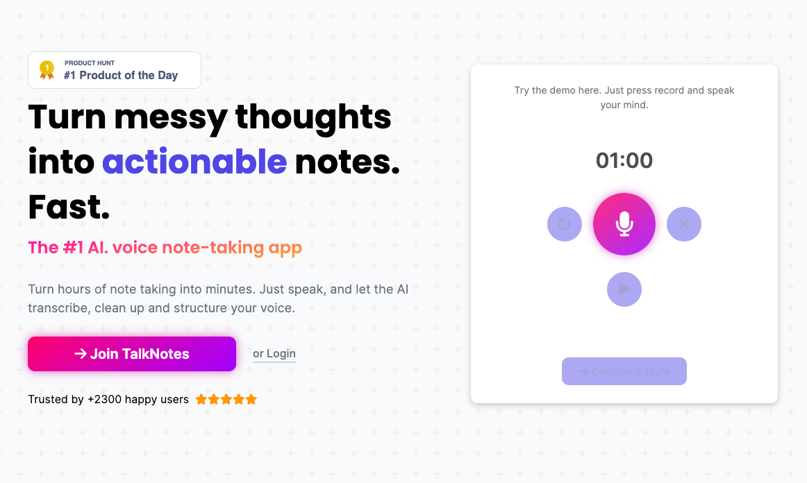
Another example I love: TalkNotes. It’s a cool tool that converts voice into clear & organized notes. The button on the right allows you to try it yourself for 60 seconds. The button doesn’t even have a label. Just an icon. And the CTA is crystal clear.
What a delight.
Other examples of “Try it yourself” playgrounds:
Tiiny.host (this one does require some friction to see the result)
🔥 The bottom line
Build a playground for your (soon-to-be) users, allowing them to experience your product's value without sign-ups or friction. Ensure your homepage directs them there with a proper CTA, such as “Try it yourself”, alongside your revenue-oriented buttons.
See you next week ✌️
Tom
P.S. Product tours (i.e. the “Take a Tour” CTA) are the best of the worst, but still not recommended. They limit user interaction and the experience isn't immersive. See Optimizely or Ramp for example—you can’t really play with the product.
P.P.S. If your product can't offer an interactive demo, mimic the actual experience on your landing page. Check out Muzzle for inspiration.


good content
As usual, well written and actionable! Thanks for sharing!
I am actually planning of adding an interactive demo for our platform.
I'm aiming it for another type of user though. Those who already pay for our low tier packages, to experience (when they are ready for it) what they could get from higher tier features.